Why Severance Merch Designs Matter to Fans
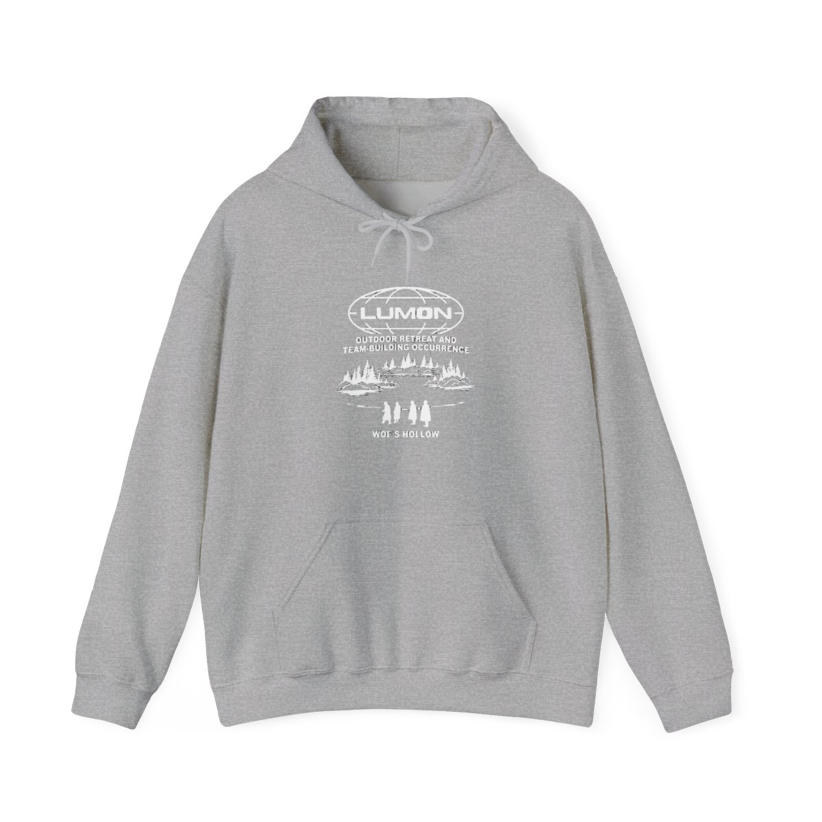
I remember the first time a fan showed me their Severance collection. They had the Lumon logo hoodie, a green keychain shaped like the macrodata refinement numbers, and a poster referencing the Perpetuity Wing. Their eyes lit up as they explained each piece: "This isn't just a logo - it's a conversation starter about work-life balance, identity, and the eerie calm of Lumon Industries." That moment reminded me why I love designing merch for this show. People don't just wear it; they use it to connect with others who understand the layers.
Severance merchandise goes beyond typical TV show apparel. Each design carries hidden references that only fans catch. The show's deliberate ambiguity - the mysterious goat department, the unsettling wellness sessions - creates a craving for tangible symbols. Fans want to wear their theories, their questions, and their love for Kier Eagan's absurd philosophies. Severance merch meaning often lies in those subtle callbacks that spark recognition among the initiated.
As a merch designer, I study the show's visual language intently. The palette, the typography, the specific shapes - every element on a hoodie or mug should echo an in-world detail. For example, the orangey-blue combo from the macrodata refinement screens is more than pleasant; it's a nod to the show's emotional binary. The best designs make you feel like you're part of Lumon's strange universe while questioning it.